18.04.26
User experience in insurance: A guide for digital leaders

TL;DR:
- Improving insurance UX requires a holistic, end-to-end approach across all lifecycle stages.
- Benchmarking and pain-point mapping are essential for effective user experience enhancements.
- True UX success depends on consistency, measurement, and continuous iteration across the entire customer journey.
Many insurers treat user experience as a digital facelift, swapping out a clunky portal for a cleaner interface and declaring the job done. That instinct is understandable, but it leaves the most impactful opportunities untouched. ACSI satisfaction benchmarks reveal that UX performance is measured across dozens of experience attributes, spanning billing clarity, claims speed, and mobile quality, not just how pretty an interface looks. For P&C insurance leaders, this distinction is not academic. It determines whether policyholders stay, refer others, and trust you at the moments that matter most. This guide cuts through the noise and gives you a clear, practical framework for understanding and improving user experience across the full insurance lifecycle.
Table of Contents
- Defining user experience in insurance: Beyond digital interfaces
- Key moments that shape insurance user experience
- Tools and frameworks for mapping and improving insurance UX
- Avoiding pitfalls: Aligning digital UX with end-to-end customer journeys
- Our perspective: Why successful insurance UX demands a holistic, benchmarked approach
- How IBSuite empowers insurers to deliver world-class user experience
- Frequently asked questions
Key Takeaways
| Point | Details |
|---|---|
| True UX goes beyond UI | User experience in insurance encompasses every policyholder and employee touchpoint, not just digital form design. |
| Claims journeys matter most | High-stakes moments like claims require empathetic communication, transparency, and streamlined processes. |
| Benchmark and iterate | Measuring specific experience attributes and using industry benchmarks are essential for continuous UX improvement. |
| End-to-end alignment is vital | Digital innovations must match real-world delivery throughout the entire customer journey for genuine transformation. |
Defining user experience in insurance: Beyond digital interfaces
The terms UX, UI, and CX are used almost interchangeably in insurance boardrooms, and that confusion costs real money. User interface (UI) refers to the visual and interactive layer: buttons, forms, layouts. Customer experience (CX) is the broader emotional and relational impression a policyholder forms over time. User experience (UX) sits between these two. It is the end-to-end design of how policyholders and employees accomplish insurance tasks, measured at key experience touchpoints such as buying a policy, filing a claim, or updating billing details.
This distinction matters because it changes where you invest attention. A slick quoting tool with a poor claims follow-up process produces a net negative UX. Policyholders remember the worst moment, not the prettiest screen.
In practice, strong insurance UX must address at least three groups of real activities:
- Policy buying: Clarity of product information, speed of quote generation, ease of document submission
- Policy servicing: Self-service options, accuracy of account information, responsiveness of support channels
- Claims filing: Transparency of progress, speed of acknowledgement, empathy in communication
Critically, UX in insurance also applies to employees. Underwriters, claims handlers, and agents all interact with core systems daily. Poor internal UX slows decisions, increases errors, and frustrates staff who are trying to serve customers well. An insurance customer experience guide that ignores the employee journey is only half a guide.
Industry benchmarks measure UX quality at the attribute level: mobile app performance, ease of reaching a representative, speed of claim resolution, and billing transparency. Each of these is a measurable signal, not an opinion.
“The strength of your UX is not determined by your best feature. It is determined by how well every interaction in the journey holds together under pressure.”
For insurance leaders, user experience optimisation means committing to measurement at every touchpoint, not just the ones your digital team built last quarter. It also means acknowledging that the insurance self-service engagement layer, while important, is only one part of a much larger picture.
Key moments that shape insurance user experience
Once the definition is clear, it becomes vital to map where great, or poor, UX truly counts in the insurance journey. Not all touchpoints carry equal weight. Some moments are routine; others are high-stakes and emotionally charged. Getting those right is where loyalty is won or lost.
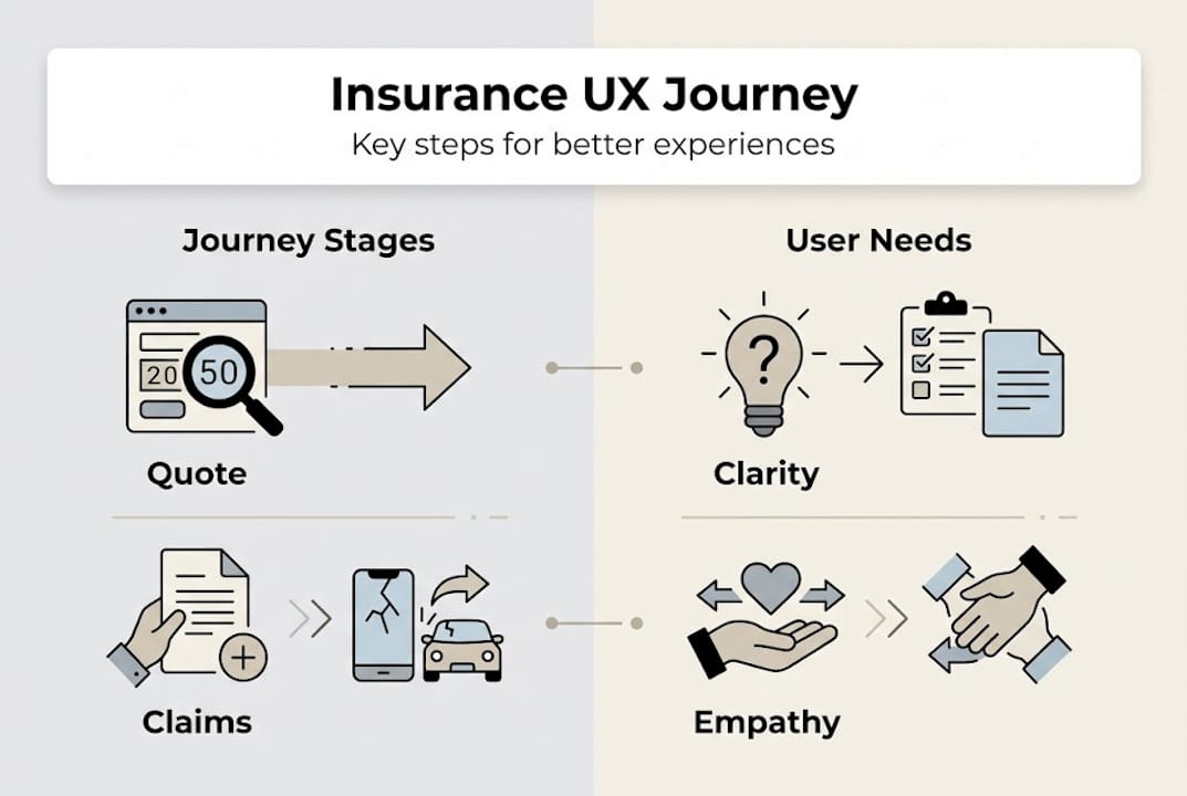
The four most consequential moments in the P&C insurance lifecycle are:
- Quote and purchase: First impressions, pricing clarity, and ease of completing the application
- Onboarding: Policy delivery, documentation clarity, and welcome communications
- Servicing: Mid-term changes, billing queries, and account management
- Claims: The ultimate test of the insurance promise
Lifecycle transitions under stress are the most challenging UX moments, requiring empathetic communication and transparent progress updates. A policyholder filing a claim after a house fire or a road accident is not browsing: they are vulnerable. At that moment, a confusing status page or an unreturned call is not just a UX failure. It is a breach of trust.
| Journey moment | Customer expectation | Typical outcome |
|---|---|---|
| Quote | Instant, clear pricing | Often complex, multi-step forms |
| Onboarding | Simple, guided setup | Dense policy documents |
| Servicing | Self-service, 24/7 access | Limited portal functionality |
| Claims | Speed, empathy, transparency | Delays, poor status visibility |
The gap between expectation and outcome at claims is particularly stark. Digital leaders who want to close this gap should explore modern claims experience models that embed status transparency and proactive communication from the outset.
Understanding insurance customer experience trends in 2026 confirms that policyholders increasingly expect the same digital confidence they get from banking and retail. The bar is rising, and interface design in insurance is now a competitive differentiator, not a hygiene factor.

Pro Tip: Map your highest-stress customer journey moments first. Identify the three touchpoints where a policyholder is most anxious or uncertain, then audit those for clarity, speed, and empathetic tone before optimising anything else.
Tools and frameworks for mapping and improving insurance UX
To move from insight to action, leaders need reliable frameworks and metrics to improve user journeys. The good news is that proven methodologies already exist. The challenge is applying them with discipline across every channel and lifecycle stage.
Journey mapping is the starting point. A well-constructed journey map plots every step a policyholder or employee takes, from initial search through to renewal, including the touchpoints, channels, and roles involved. It highlights where friction accumulates and where emotional peaks and troughs occur. Practical client journey mapping helps teams move beyond assumption and into evidence-based prioritisation.
Journey mapping and continuous feedback feed process improvements, training decisions, and systemic platform changes. Without this loop, improvements remain isolated and short-lived.
For quantification, internal KPIs provide the most actionable signals:
| KPI category | Example metric | What it reveals |
|---|---|---|
| Digital drop-off | Abandonment rate at quote step 3 | Friction in the buying process |
| Task completion | Time to submit a claim online | Efficiency of claims UX |
| Complaint drivers | Top 5 recurring complaint themes | Systemic UX failures |
| Resolution speed | Average claim acknowledgement time | Claims empathy and process quality |
External benchmarking adds vital context. Corporate Insight’s benchmark uses 170 attributes and over 1,500 customer surveys to evaluate P&C digital experience, giving leaders an objective standard to measure against peers.
A structured UX improvement methodology for P&C insurers looks like this:
- Define the scope: which journeys and user groups are in focus
- Map the current state: document every step, channel, and pain point
- Baseline the data: gather internal KPIs and external benchmark scores
- Identify priority gaps: rank issues by frequency, impact, and fixability
- Design and test changes: prototype solutions and validate with real users
- Implement and monitor: deploy changes and track KPI movement continuously
Leaders driving digital transformation across their organisations will find this methodology translates directly into platform requirements. If you are actively digitising insurance processes, journey mapping should precede, not follow, technology selection.
Avoiding pitfalls: Aligning digital UX with end-to-end customer journeys
Even the best tools can misfire without cohesive alignment. The most common failure in insurance UX improvement programmes is a narrow focus on the digital acquisition funnel while leaving fulfilment, servicing, and claims largely unchanged.
Good digital UX may backfire if the post-sale experience fails to deliver on the pre-sale promise. Full lifecycle transformation is required to bridge that gap. An insurer that invests heavily in a polished quoting tool but then delivers slow, opaque claims handling has simply raised expectations it cannot meet. That is worse than having modest expectations across the board.
The most common UX pitfalls to avoid:
- Siloed improvements: Fixing the app without aligning the call centre creates inconsistency
- Front-end obsession: Over-investing in sales UX while neglecting claims and renewal
- Feedback blind spots: Collecting NPS data but not linking it to specific journey moments
- Technology-led design: Choosing platforms for their features rather than their ability to support the full journey
- Ignoring employee UX: Staff who struggle with internal systems cannot deliver good customer experiences
A benchmark-driven operating model helps prioritise experience improvements objectively, removing the internal politics that often distort investment decisions. When data drives the conversation, it becomes much harder to justify spending on digital aesthetics while claims satisfaction lags.
A closed-loop approach connects every improvement back to measurable outcomes. It means tracking whether a change to the claims portal actually reduced inbound calls, and whether that reduction correlated with higher satisfaction scores.
Pro Tip: Before launching any UX initiative, audit your post-sale journey with the same rigour you apply to acquisition. Map the first 90 days of a new policy and identify every point where a customer might feel confused, ignored, or misled.
Building a digital-first strategy that genuinely works requires honest assessment of where your modern insurance platform enables or constrains the full journey. A superior digital experience is not a feature set; it is a commitment to consistency across every stage.
Our perspective: Why successful insurance UX demands a holistic, benchmarked approach
The insurance industry has spent years chasing digital-first transformation, and many carriers have built impressive front-end capabilities. But we see a recurring pattern: investment clusters around acquisition and sales, while the back-half of the journey, servicing, billing, and claims, remains largely unchanged.
The uncomfortable reality is that policyholders do not judge their insurer by how easy it was to buy. They judge you by how you behaved when something went wrong. If your claims experience is opaque or your billing queries go unanswered, no amount of polished quoting UX will rescue the relationship.
We believe true UX transformation closes the expectation-delivery gap at every lifecycle stage, for policyholders and for the staff who serve them. That requires externally benchmarked measurement, not just internal satisfaction surveys. It requires holding every process to the same standard you apply to your digital front end.
A comprehensive insurance UX strategy is not a project with an end date. It is an operating discipline, driven by data, iterated continuously, and owned at the leadership level.
How IBSuite empowers insurers to deliver world-class user experience
If you are ready to put these principles into practice, IBSuite provides the platform foundation to do it. Built on AWS and designed as an API-first, cloud-native core system, IBSuite supports the full insurance value chain, from quoting and underwriting through to policy administration, claims, billing, and CRM. That means every lifecycle stage sits within a single, integrated environment, making it far easier to deliver consistent, measurable UX across every touchpoint. IBSuite’s Evergreen update model ensures you stay current without disruptive upgrade cycles, and its open integration architecture allows you to connect benchmarking and feedback tools directly into your operational workflows. If you would like to see how IBSuite translates these principles into measurable outcomes, speak with our team about a tailored demonstration.
Frequently asked questions
How is user experience measured in insurance?
User experience is measured through specific satisfaction categories such as mobile app quality, ease of billing, and speed of claims, tracked by industry benchmarks that break digital experience down by attribute rather than overall impression.
Why is UX crucial during claim processes?
Claims are high-stress moments where clear status updates, proactive progress communication, and empathetic handling are essential to reduce emotional uncertainty and retain policyholder trust.
What are common pitfalls in improving insurance UX?
Focusing only on digital interfaces and neglecting post-sale experiences creates a disconnect between expectation and delivery, which means digital UX must align with the full end-to-end journey to avoid undermining trust.
Which frameworks help in mapping insurance user journeys?
Journey mapping, external benchmarking, and KPIs such as drop-off rates and task completion times are essential tools, and journey mapping with feedback loops underpin any practical UX improvement methodology.
Recommended
- Insurance Customer Experience: Complete Guide for 2025 – Digital Insurance Platform | IBSuite Insurance Software | Modern Insurance System
- Insurance Digital Transformation Guide for Effective Change – Digital Insurance Platform | IBSuite Insurance Software | Modern Insurance System
- Drivers of Digital Transformation in the Insurance Industry – Digital Insurance Platform | IBSuite Insurance Software | Modern Insurance System
- Insurance Customer Experience 2025: Shaping Engagement and Growth